- Arlina Roman
- Jul 14, 2020
- 1 min read

It makes a strong first impression. If your logo does not look professional, you lose too many potential clients. It's a way to communicate ownership. The colors and symbolism need to work together effectively to represent your business in a truthful way.
Recognition. Once you have a logo, you can put it anywhere you want. Advertisement is key to get your business out there in the public eye. You want something memorable, like the Target or Apple logo for example.
Separation from competition. There are countless businesses who have the same services. Want to stand out? Have a logo that is entirely unique for that industry. For example, I designed a logo for a plumbing business and, believe it or not, it's not a wrench but an aviation emblem! Get the people talking and automatically create new clients!
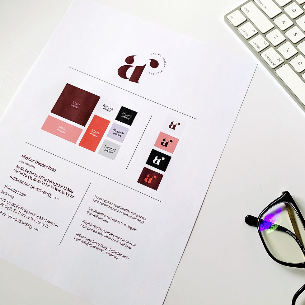
To be consistent. Just like I mentioned in my previous post about why you need a color palette for your brand. You can have multiple logos but they all have to use the same range of color. You can have horizontal, vertical and/or icon logos that people will automatically familiarize with and connect to your business. Don't change it up and confuse your audience!


Comments