- Jul 14, 2020
- 1 min read

Use empty space. It’s part of the composition and you’re using it to focus on one part of the design, either a photo or text. Don’t be intimidated by it!
Bare necessities. Simplification is hard to do, but easy to understand. Get rid of elements that don’t serve a purpose to your designs.
Balance. This takes time and practice. Example: left justify type for legibility, aim for symmetry.
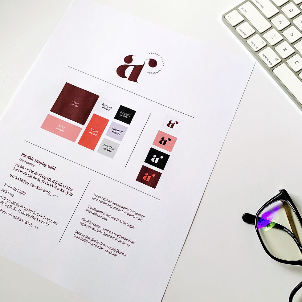
Use only ONE typeface. A typeface is a range of weights (light, regular, italic, bold, etc.) in the same style of a font. The overall composition will look clean and consistent.
Grids/Guides. They keep elements aligned and have everything match up.


Comments